You read the title, and you're probably already confused. You're sure your eyes don't deceive you. We're not messing with you. It's a trick in color science just about as old as the idea of army men being green. So what gives? is it just to blend in with vegetation? Or is it deeper?
A note: cameras, monitors, and the processing between can change colors to not be what they might appear! We talk about reference colors and why they're important later...
It's all Yellow? Always has been.
We'll start with the first ice-breaking statement. Military Greys are Blue and that classic NATO Olive green you might know as "ranger green" is Yellow/Brown.
Now let's back up.
If you take a look at a common "Grey" swatch of fabric on tactical gear, paint, etc, you might notice that despite it being "Greyscale" there's not a perfect 100% absence of color.
"Wolf" grey typically has an extremely subtle "cool" temperature, making it more applicable for tundra & alpine environments that are brightly lit and wash out most of the "color" of objects including soldiers. But "cool" colors can stick out like a sore thumb in some cases, so the US thought of a different way to go grey...
You'll see grey gear like the PCU system (above and below) from various US Special Forces add a twinge of warmth to make it slightly more applicable in more environments, sometimes referred to as "Alpha Grey" or "Alpha Green". Just a 1-5% change in the color temp makes it much more usable where there's even a bit more color in the environment.

Elite counter-terror units across Europe (such as the Dutch DSI Politie below) on the other hand can be seen in their decidedly "cold" wolf greys, however. But that's not a bad thing - urban/manmade settings are naturally a little "colder" so urban camos tend to air on the "truer" grey. Some departments also believe it still retains a "professional" look without looking too "military" too, so the psychological aspect definitely matters with color choice.
The professionalism part, well, you be the judge.
![Dutch DSI (Dienst Speciale Interventies) members during training [1080x1350] : r/MilitaryPorn](https://preview.redd.it/dutch-dsi-dienst-speciale-interventies-members-during-v0-817drzjmn20e1.jpeg?auto=webp&s=bf403b488096b4772becb98630ce329db49732c4)
So what does any of that have to do with NATO Olive, Ranger Green, or Austria's Green?
Well, like we said, Ranger Green is really "brown" or a really dirty, desaturated "Yellow" than anything else.
It's harder to see on fabrics, but easier to see on a flat color swatch. If you don't believe us, screengrab the photo below and play with the color adjustment in a photo editing software. You'll be surprised to see what happens when you play with a few of the sliders...

We go pretty far to make sure our photos are true-to-color, using some of the best lighting equipment money can buy! You can see how lighting is everything when it comes to how a color appears. It's almost completely black in the shadows, and much lighter in worn/highlight areas!
This "green" being somewhere between the color of soils and the color of trees is what has made it such a universally adopted "military" green. But throughout history there's been some disagreement. The US's old "OD" is definitely more saturated, and the "Foliage" green used alongside the US's "UCP" is definitely cooler and more meant to match the rest of that uniform.

.jpg)
Eventually, "Ranger Green", "MAS Grey (from London Bridge Trading)", the officially designated color "RAL 7013" used by NATO and other decidedly darker, less saturated "brown greys" became the predominant default flat color for many militaries & police units around the world for its broad applicability.

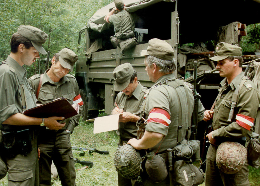
They've never called it green - it's always been "Braungrau" or literally "Brown-Grey". The Austrian military specifically picked a reference color as opposed to a target shade of green in order to have consistency across as much of their gear as possible.
RAL 7013 (Braungrau) is the same "color" whether it's woven in fabric or painted on a tank, even if it sort of looks different due to the material changes. The level of saturation, temperature, and mix of primary colors in essence is the same.
Sometimes, as you probably noticed in the photo above, different materials in RAL 7013 can result in wildly different shades/temps of Braungrau.

It's the same way that manufacturers use what's called the Pantone library today to make sure their branding, products, and other kinds of media is all color matched regardless of if it's on screen, on a shirt, or made of plastic.
Tricking your brain
Human brains, unless you're colorblind of course, are great at discerning between different shades of green, but only if you commit them to memory...

In fact, most of learning color science is being able to give names to colors in order to discern them apart. The average layman might not notice the difference between OD and "Ranger" green because they aren't paying attention, yet the astute observations of a tactical gear autist (like us) can see right through manufacturer's apparent inability to produce the same shade of green across a few products.
As they say here on the internet, "once you see it, you can't unsee it."
Or sometimes, rather, the idea is that it's too boring to see it at all.
The concept of using green to camouflage or deliberately make people ignore things has an interesting, documented use in Disney Theme Parks. Their signature "go-away green" is painted on the backs of rides, hidden speakers, and other things to not only camouflage things, but to make it seem too "boring" to the human eye to process too.

A speaker at Tokyo Disneyland painted "go away green". You can see it's hard to say it's really "camouflaged" as much as it's just made to look boring next to those beautiful flowers, so you don't notice when you're not actively looking for it. That's the effective difference between camouflage patterns, and something like this.
Next time your wife/kid drags you to Disney World, try looking around and seeing if you can find that green... But it's not just there.
That electrical box on your street? it's also a similar "go away green". Industrial equipment in plain sight? Green. Public trash bins? Green! The 5G tower hidden in the trees? Yep, they use "go away green" there too. Again, it's not to completely hide something from someone looking for it, It's to make it just boring enough that you don't notice or attempt to mess with it.

So, whether it's an object hidden in plain sight or a truly adaptable camouflage from afar on your country's soldiers, Green isn't just good. It's great.
But remember it's not green at all. It's desaturated yellow-brown-grey, and you'll never see it the same way.
Share:
From The Viggen to the Infantryman: M90 Camouflage
Disruptive Painted Material: British Camo from its Painterly roots